CSS-GRID

CSS-GRID

Introduction
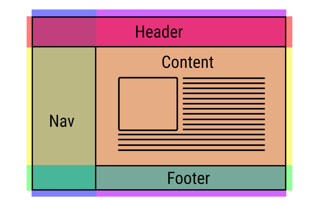
As the name implies, CSS Grid operates within a grid layout: a set of rows and columns (not unlike a table). To create a grid with CSS Grid, you specify how many columns wide it should be, and how many of those columns any particular piece of content should occupy.
CSS Grid Layout Module
The CSS Grid Layout Module offers a grid-based layout system, with rows and columns, making it easier to design web pages without having to use floats and positioning.
Basics and browser support
As of March 2017, most browsers shipped native, unprefixed support for CSS Grid: Chrome (including on Android), Firefox, Safari (including on iOS), and Opera. Internet Explorer 10 and 11 on the other hand support it, but it’s an old implementation with an outdated syntax. The time to build with grid is now!
To get started you have to define a container element as a grid with display: grid, set the column and row sizes with grid-template-columns and grid-template-rows, and then place its child elements into the grid with grid-column and grid-row. Similarly to flex box, the source order of the grid items doesn’t matter. Your CSS can place them in any order, which makes it super easy to rearrange your grid with media queries. Imagine defining the layout of your entire page, and then completely rearranging it to accommodate a different screen width all with only a couple lines of CSS. Grid is one of the most powerful CSS modules ever introduced.