CSS FLEX
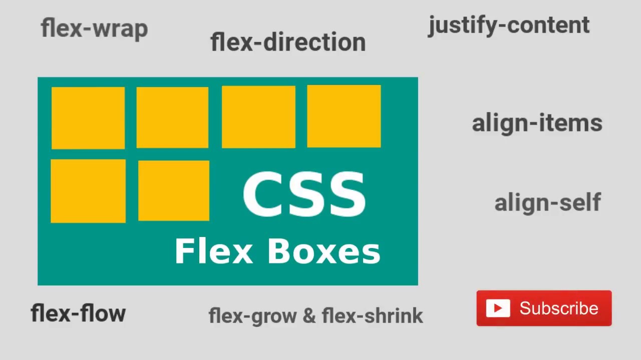
CSS Flex-box Layout Module
Before the Flex-box Layout module, there were four layout modes:
-
Block, for sections in a webpage
-
Inline, for text
-
Table, for two-dimensional table data
-
Positioned, for explicit position of an element.
The Flexible Box Layout Module, makes it easier to design flexible responsive layout structure without using float or positioning.
Flex-box Elements
To start using the Flex-box model, you need to first define a flex container.
Example
A flex container with three flex items:
<div class="flex-container">
<div>1</div>
<div>2</div>
<div>3</div></div>
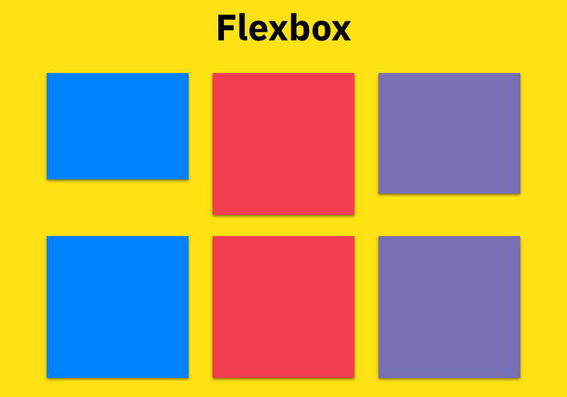
Parent Element (Container)
Like we specified in the previous chapter,this is a flex container (the yellow area) with three flex items:
The flex container becomes flexible by setting the display property to flex
Example
flex-container
{
display: flex;
}
The flex container properties are
